Ridesharing and taxi mobile apps – Things to consider
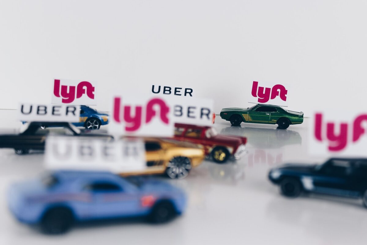
Since the inception of ride-sharing and taxi mobile apps, the taxi industry has changed considerably. Apps like Uber, GrabTaxi, Hailo and even taxi companies’ own booking apps are so convenient that they have essentially replaced the traditional waving action for flagging down a taxi. Due to the success of these apps, a wave of similar apps is coming in to take a share of the market. Just in “tiny red dot” Singapore alone, 2 more companies (Karhoo and ConnexTaxi) are slated to roll out their variations of the ride-sharing and taxi apps in 2016. Services and pricing offered by the companies of these apps are eventually going to converge to a certain standard as competition gets stiffer. If companies want to keep their customer base or attract new customers, it all boils down to the user experience (UX) of their apps. After all, companies with higher satisfaction are proven to be more successful.
Curious about the current competition in the industry, Objective Experience Singapore conducted a pilot study evaluating the UX of the two most popular ride-sharing and taxi mobile apps in Singapore — Uber and GrabTaxi. Utilising our expertise in eye-tracking technology, we conducted the study using the Tobii Pro Glasses 2, which is ideal for observing how users interact with the mobile apps in real life, instead of artificial lab environments. We uncovered findings about how people used Uber and GrabTaxi, and we proposed 4 main design considerations from these.